So we struggled with these styles. It was probably especially tedious to write out the highlighting for adjectives.
Now imagine that someone comes to you and says that all adjectives must be highlighted in grey-brown-crimson with a border.
So you go into the document and edit every span. Of course, you could use a replacement, but what if you highlighted not only adjectives in yellow, but also all sorts of other words? In that case, you’d still have to check everything manually.
To avoid this problem, classes were invented.
A class is a named set of attributes. It can be linked to a tag via the class attribute.
I will use this file, and you can use yours
<div style="background:#cceb92 ;text-align: centre;font-weight: bold; padding: 8px 16px ;border: 2px solid rgb(230, 139, 21)"">
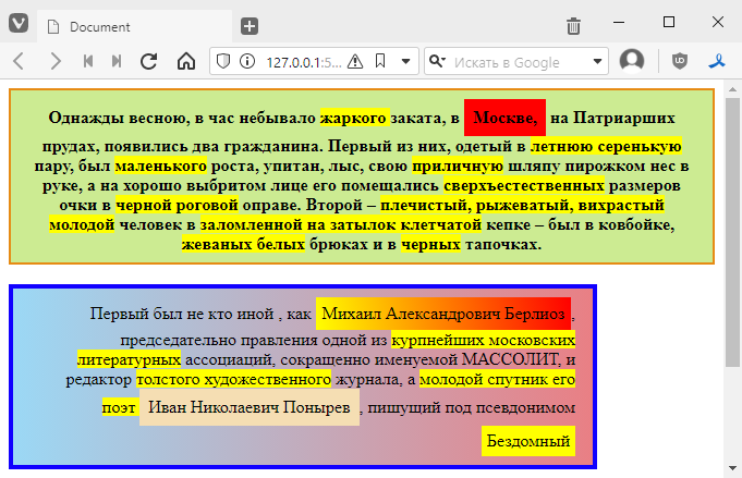
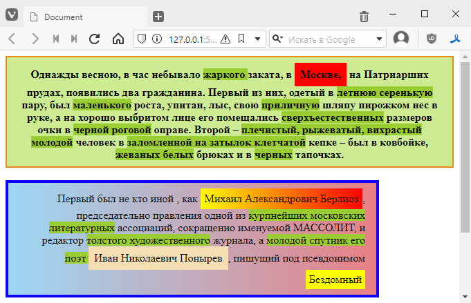
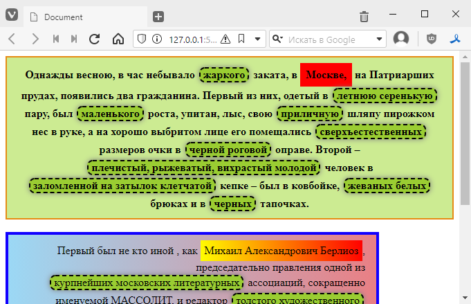
Once upon a time in spring, at the hour of an unusually <span style="background: yellow;">hot </span> sunset, in <span style="display: inline-block; padding: 8px; background: red;">Moscow,</span>
at the Patriarch's Ponds, two citizens appeared.
The first of them, dressed in a <span style="background: yellow;">light grey summer suit</span> ,
was <span style="background: yellow;">short</span> in stature, well-fed, bald, carrying his <span style="background: yellow;">decent</span> hat
in his hand, and on his well-shaven face were
<span style="background: yellow;">supernatural</span> glasses in <span style="background: yellow;">black horn-rimmed</span> frames.
The second was a broad-shouldered, reddish-haired, curly-haired young man in
a checked cap tilted back on his head, was wearing a cowboy hat,
<span style="background: yellow;">chewed white</span> trousers and <span style="background: yellow;">black</span> slippers.
</div>
<br>
<div style="text-align: right; width: 500px; background:linear-gradient(90deg, #9bd8f5, #e97f84 ); padding: 8px 16px; border: 4px solid rgb(17, 0, 255);">
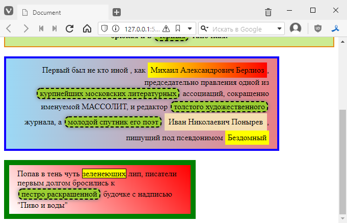
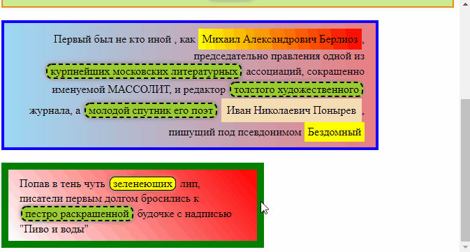
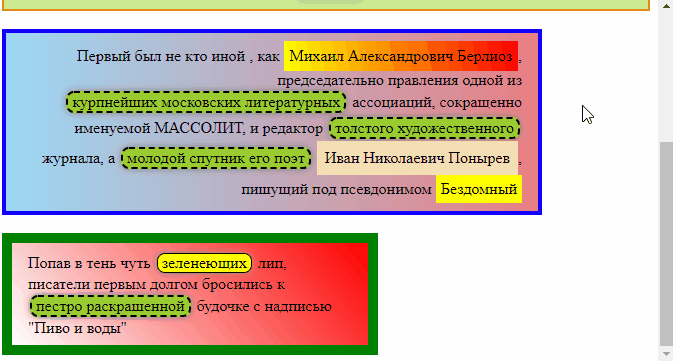
The first was none other than <span style="display:inline-block; padding: 6px; background: linear-gradient(80deg, yellow , red); ">Mikhail Alexandrovich Berlioz</span>,
chairman of the board of one of the <span style="background: yellow;">largest Moscow literary</span> associations, abbreviated as MASSOLIT, and editor of a <span style="background: yellow;">thick art</span>
magazine, and <span style="background: yellow;">his young companion, the poet</span>
<span style="display: inline-block; padding: 8px; background: wheat;">Ivan Nikolaevich Ponyrev</span>, writing under the
pseudonym <span style="display: inline-block; padding: 5px; background: yellow;">Homeless</span>
</div>
<br>
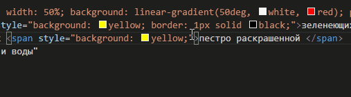
<div style="text-align: left; width: 50%; background: linear-gradient(50deg, white, red); padding: 8px 16px; border: 10px solid green;">
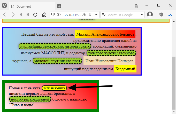
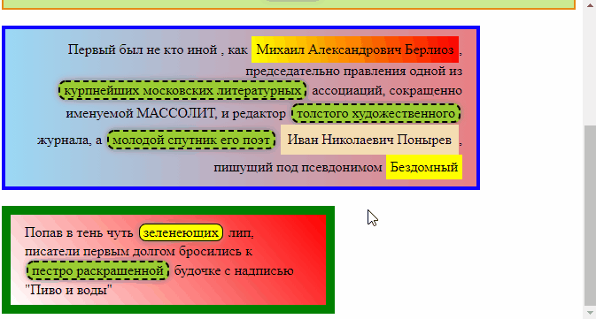
Finding themselves in the shade of slightly <span style="background: yellow; border: 1px solid black;">green</span> lime trees, the writers
rushed to <span style="background: yellow;">a colourfully painted </span>
booth with the inscription ‘Beer and Water’
</div>
All adjectives are highlighted as follows, with (almost) the same style attribute for all of them.
<span style="background: yellow;">colourfully painted </span>
To add a class, you need to insert a special paired tag <style> into the code markup, for example, right after all divs.
<div style="background:#cceb92 ;text-align: centre;font-weight: bold; padding: 8px 16px ;border: 2px solid rgb(230, 139, 21)"">
  <!-- ... -->
    booth with the inscription ‘Beer and water’
</div>

<style>
    /* comments inside style are written like this */
   /* now we will create a class here */
</style>
add a class inside style. The name of the class inside the style tag must be written with a dot, like this
<style>
    .adjective {

    }
</style>
Inside the curly brackets, we will list the styles. We have one style, so we added it
<style>
    .adjective {
        background: yellow;
    }
</style>
Now we will remove the style attribute from all adjectives and add the class attribute, that is
<span style="background: yellow;">colourfully painted </span>
Replace with
<span class="adjective">colourfully painted </span>
Please note that we write the name without a full stop in the attribute.
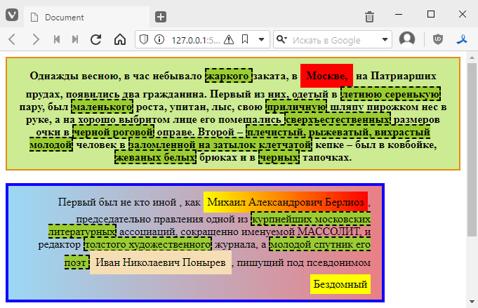
Next, we do the same with all the adjectives. Since they look the same, we can use the multi-cursor and replace them all at once.
To do this, we select one style with the style, like this

and then start pressing Ctrl+D until all elements with the same content are selected:

and write in all places at once

visually, nothing should change
Now all adjectives are linked to the adjective class.
The coolest thing is that now we can change their colour by changing just one line, like this:
<style>
    .adjective {
        background: yellowgreen;
    }
</style>
We can add a border
.adjective {
    background: yellowgreen;
    border: 2px dashed black;
}
Let’s add some cool styles:
.adjective {
    background: yellowgreen;
    border: 2px dashed black;
    display: inline-block; /* we already know this, just so that the adjectives are like blocks */
    margin: 2px; /* margins on all sides */
    padding: 0 4px; /* margins inside the border */
    border-radius: 8px; /* round the borders */
    box-shadow: 0 0 8px grey; /* add a shadow, 0 0 is its offset relative to the block, 8px is the shadow radius, and so on */
}
It looks more interesting now:
By the way, we have one adjective with a border that we forgot to add a class to, which is why it stands out from the overall style.
In fact, we can attach it to the class and still keep the style. That is, we will add a class to
<span style="background: yellow; border: 1px solid black;">green</span>
and it will look like this
<span class="adjective" style="background: yellow; border: 1px solid black;">green</span>
and it looks like this
In fact, some very important things happened here. Namely, the styles from style overrode those in the adjective class. That is, yellow is used for the background instead of green from adjective, and the border is thin and without gaps. This is standard behaviour. In other words, the style is always more important than what is in the class.
Although in reality we can make the class style more important than the tag style, to do this we need to add the word !important. For example, if I want the frame from the class to override the style, I would do this:
.adjective {
    background: yellowgreen;
    border: 2px dashed black !important; /* added !important at the end */
    /* ... */
}
tydish:

As a special twist, we can basically put !important inside the style, and then it will become more important than what is in the class:
<span class="adjective" style="background: yellow; border: 1px solid black !important;">
back to top

But in general, people who use !important are very disliked and may even be beaten up. So never use !important.
Adding a mouse reaction
Another feature that classes add is the ability to react to mouse hover. This is done using so-called pseudo-classes.
When you hover your mouse over a tag, the :hover class is implicitly added to it, and we can change how the block is displayed by adding a new class, like this
<style>
.adjective {
    /* … */
}

.adjective:hover {
    /* now let's add something here */
}
</style>
For example, let’s add a background change, like this:
.adjective:hover {
    background: skyblue;
}
As you can see, the styles from .adjective:hover overwrite the class values. You can also add some styles that are not present in the base class. For example, I can make the cursor turn into a pointing finger
.adjective:hover {
    background: skyblue;
    cursor: pointer;
}
Like this
By the way, ‘greening’ does not react to the colour change because there is an !important attribute there.
You may have noticed that the colour change is very abrupt.
We can add so-called transitions between parameters, i.e. one colour will smoothly transition into another. To do this, simply add the following style to the base class
.adjective {
    /* ... */
    transition: all 0.3s; /* all means that we smooth all transitions, 0.3s is the transition speed in seconds */
}

/* we don't touch this */
.adjective:hover {
    background: skyblue;
    cursor: pointer;
}
now everything changes very smoothly

if you play around with styles, you can achieve some very unusual effects
.adjective:hover {
    background: skyblue;
    cursor: pointer;
    border-width: 4px; /* change the border width, but you can only specify the width */
    padding: 6px; /* change the padding from the border */
    box-shadow: 0 0 30px white; /* make the shadow white and larger, creating the illusion of glow */
}
But of course, it’s better not to overuse sizes and indents.
Now you can start working on the task =)
Task
Replace styles with classes to make it easier to understand the following task
- for the first paragraph, name the class paragraph1
- for the second paragraph, name the class paragraph2
- for the third paragraph, name the class paragraph3
- For proper names, use the class name
- For proper names, only transfer general styles to the class, leaving specific styles, such as background colour, in the tags.
Add a mouseover reaction, as desired