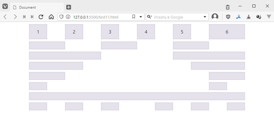
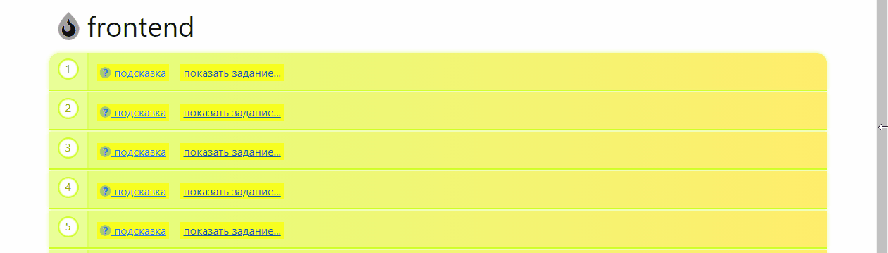
Using Bootstrap, lay out as shown in the image.
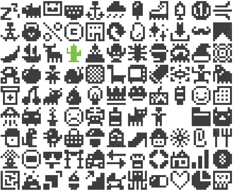
Or, if you feel more confident, lay out the blocks to create a pixel icon.
So, today we’re going to look at Bootstrap.
This is a so-called UI framework, i.e. a set of classes with styles + a small number of scripts. It allows you to quickly create a decent-looking interface or make a layout skeleton and then fine-tune the styles to suit your needs.
Available here: https://getbootstrap.com
You don’t need to install anything to start using Bootstrap. Like Font Awesome, it is simply a file that connects to your file.
Let’s create an empty document
<!DOCTYPE html>
<html lang="en">
<head>
    <meta charset="UTF-8">
    <meta name="viewport" content="width=device-width, initial-scale=1.0">
    <title>Document</title>
</head>
<body>

</body>
</html>
Go here https://getbootstrap.com/docs/5.0/getting-started/introduction/
copy the path to the style file:
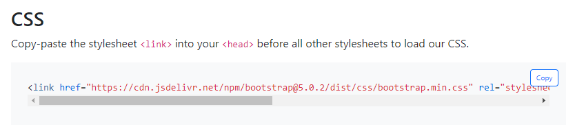
and paste it into the head
<!DOCTYPE html>
<html lang="en">
<head>
    <meta charset="UTF-8">
    <meta name="viewport" content="width=device-width, initial-scale=1.0">
    <title>Document</title>
    <link href="https://cdn.jsdelivr.net/npm/bootstrap@5.0.2/dist/css/bootstrap.min.css" rel="stylesheet" integrity=‘sha384-EVSTQN3/azprG1Anm3QDgpJLIm9Nao0Yz1ztcQTwFspd3yD65VohhpuuCOmLASjC’ crossorigin="anonymous">
</head>
<body>

</body>
</html>
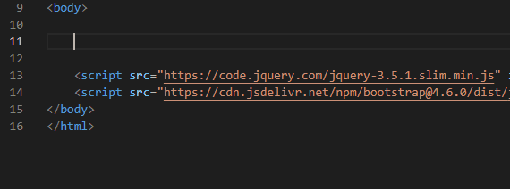
Next, copy the path with the scripts. They will not affect anything visually, but they will add interactive functionality.
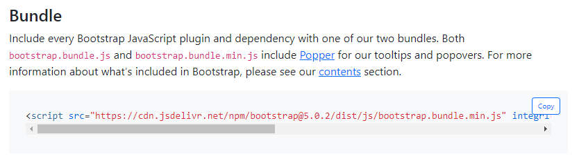
Scripts are usually placed at the end of the page, like this:
<!DOCTYPE html>
<html lang="en">
<head>
    <meta charset="UTF-8">
    <meta name="viewport" content="width=device-width, initial-scale=1.0">
    <title>Document</title>
    <link href="https://cdn.jsdelivr.net/npm/bootstrap@5.0.2/dist/css/bootstrap.min.css" rel="stylesheet" integrity=‘sha384-EVSTQN3/azprG1Anm3QDgpJLIm9Nao0Yz1ztcQTwFspd3yD65VohhpuuCOmLASjC’ crossorigin="anonymous">
</head>
<body>

    <!-- I WILL WRITE THE REST OF THE CODE HERE -->

    <script src="https://cdn.jsdelivr.net/npm/bootstrap@5.0.2/dist/js/bootstrap.bundle.min.js" integrity=‘sha384-MrcW6ZMFYlzcLA8Nl+NtUVF0sA7MsXsP1UyJoMp4YLEuNSfAP+JcXn/tWtIaxVXM’ crossorigin="anonymous"></script>
</body>
</html>
The development of the interface on Bootstrap is based on placing objects on a grid. The grid is implemented using the very flexes that we struggled with in previous tasks. However, everything has already been written for us, and all we have to do is use the classes.
The first thing we do is create a container block, which is a clever wrapper that makes the width of the blocks inside it somewhat elastic. Since I also use Bootstrap myself, I can immediately show you how it works with a real example, something like this:
That is, the content inside the block is not stretched across the entire width of the screen but always has small indents on the right, which are either larger or smaller depending on the width of the screen. These sizes were carefully selected by specialists in secret laboratories. The essence of them is simply to make reading more comfortable.
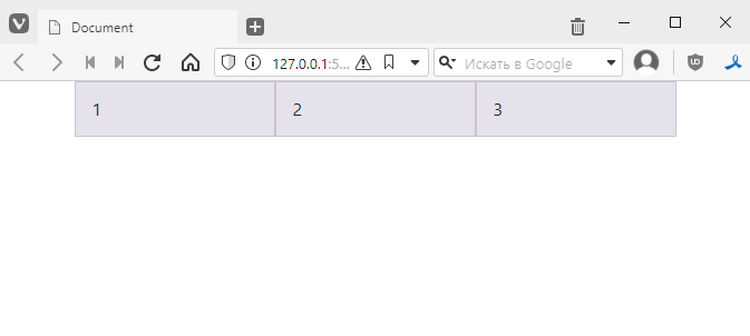
Let’s start by creating a line with three columns. Since all the styles have already been written for us, we want to write the code quickly. For such cases, Visual Studio Code has a built-in plugin that simplifies the creation of blocks with a single class. To do this, simply write a period, then the class name, and then press Tab. This is how you can quickly add everything:
The result will be as follows:
<div class="container">
    <div class="row">
        <div class="col">1</div>
        <div class="col">2</div>
        <div class="col">3</div>
    </div>
</div>
Visually, it looks like this:
I’ll add a little style to our columns to make it easier to see what’s going on. I’ll add a little tricky style: I want all blocks whose class name starts with col to have a border, background colour, and padding:
<style>
    [class^=col] {
        padding-top: .75rem;
        padding-bottom: .75rem;
        background-colour: rgba(86,61,124,.15);
        border: 1px solid rgba(86,61,124,.2);
    }
</style>
I took the style from the documentation to make it easier to navigate. This is how it should look:
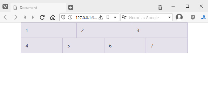
We have three columns and one row. You can add another row, for example, and write more columns in it:
<div class="container">
    <div class="row">
        <div class="col">1</div>
        <div class="col">2</div>
        <div class="col">3</div>
    </div>
    <div class="row">
        <div class="col">4</div>
        <div class="col">5</div>
        <div class="col">6</div>
        <div class="col">7</div>
    </div>
</div>
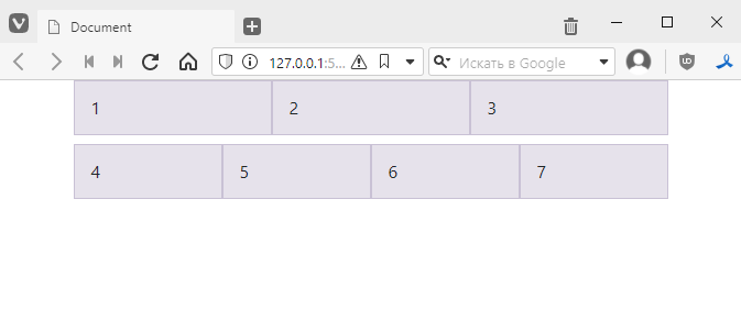
If, for example, you want to add indentation to a line, you can add a style like this:
<div class="container">
    <div class="row" style="margin-bottom: 8px;">
        <!-- ... -->
    </div>
    <div class="row">
        <!-- ... -->
    </div>
</div>
The result will be as follows:
However, Bootstrap has built-in styles for quickly adding indents, which look like this:
In general, the following will work for our option:
<div class="container">
    <div class="row mb-2">
        <!-- ... -->
    </div>
    <div class="row">
        <!-- ... -->
    </div>
</div>
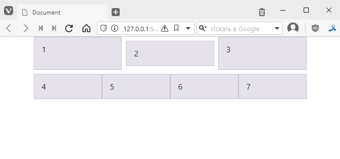
For example, you can add indents on all sides to the column with two:
<div class="container">
    <div class="row mb-2">
        <div class="col">1</div>
        <div class="col m-2">2</div>
        <div class="col">3</div>
    </div>
    <div class="row">
        <!-- ... -->
    </div>
</div>
The result will be as follows:
More details can be found here https://getbootstrap.com/docs/5.0/utilities/spacing/
Remember that in Flexbox we had the flex-grow property, where we could specify the relative size of a cell in a row.
In Bootstrap, it is accepted that a row can contain up to 12 cells, and by adding another column to the row, we can specify what fraction of the 12 cells it occupies. This is done by adding a number to the col class:
col-1 – occupies one twelfth of the rowcol-2 – occupies 2/12 of the rowcol-3 – occupies 3/12 of the rowcol-10 – occupies 10/12 of the rowcol-11 – occupies 11/12 of the rowcol-12 – occupies the entire rowLet’s try tweaking the code:
<div class="container">
    <div class="row mb-2">
        <div class="col-2">2 of 12</div>
        <div class="col-8">8 of 12</div><!-- here we must remove m-2 -->
        <div class="col-2">2 of 12</div>
    </div>
    <div class="row">
        <div class="col-1">1 of 12</div>
        <div class="col-2">2 of 12</div>
        <div class="col-3">3 of 12</div>
        <div class="col">all remaining space</div>
    </div>
</div>
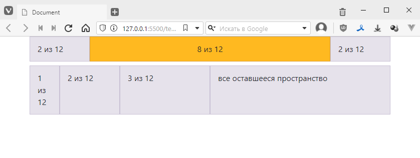
The result will be as follows:
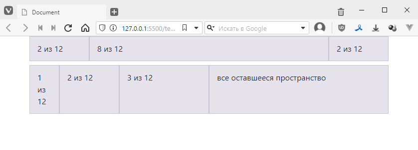
That is, everything is strict and clear.
If you want to centre align the content, you can use the text-center class:
<div class="container">
    <div class="row mb-2">
        <div class="col-2">2 of 12</div>
        <div class="col-8 text-centre" style="background-colour: rgb(255, 185, 32);">8 of 12</div><!-- added class and coloured -->
        <div class="col-2">2 of 12</div>
    </div>
    <div class="row">
        <!-- ... -->
    </div>
</div>
The result will be as follows:
If you want the alignment to be not only horizontal but also vertical, you will need to specify that the column is also a flex block. Fortunately, this is also very easy to do. Just add the d-flex class, which is equivalent to adding the display: flex property.
<div class="container">
    <div class="row mb-2">
        <!-- ... -->
    </div>
    <div class="row">
        <div class="col-1">1 of 12</div>
        <div class="col-2">2 of 12</div>
        <!-- added class and coloured -->
        <div class="col-3 d-flex" style="background-colour: rgb(255, 32, 188);">3 of 12</div>
        <div class="col">all remaining space</div>
    </div>
</div>
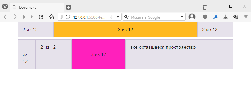
looks like this:

and now, to specify both vertical and horizontal alignment, we add the following instead of the style
align-items: centre – class align-items-centrejustify-content: centre – class justify-content-centreThe result is as follows:
<div class="col-3 d-flex justify-content-centre align-items-centre" style="background-colour: rgb(255, 32, 188);">3 of 12</div>
beauty:
more details about this can be found here https://getbootstrap.com/docs/5.0/utilities/flex/
In addition to placing objects strictly on the grid, you can also make indents using styles such as offset-*. Where instead of an asterisk, a number from 1 to 12 is substituted, showing how many cells to use as an indent.
For example, I will remove the block 3 of 12
<div class="container">
    <div class="row mb-2">
        <div class="col-2">2 of 12</div>
        <div class="col-8 text-center" style="background-colour: rgb(255, 185, 32);">8 of 12</div>
        <div class="col-2">2 of 12</div>
    </div>
    <div class="row">
        <div class="col-1">1 of 12</div>
        <div class="col-2">2 of 12</div>
        <!-- removed -->
        <div class="col">all remaining space</div>
    </div>
</div>
I can insert empty space in place of this block if I add the following div:
    <div class="container">
        <div class="row mb-2">
            <!-- ... -->
        </div>
        <div class="row">
            <div class="col-1">1 of 12</div>
            <div class="col-2">2 of 12</div>
            <div class="offset-3"></div> <!-- added -->
            <div class="col">all remaining space</div>
        </div>
    </div>
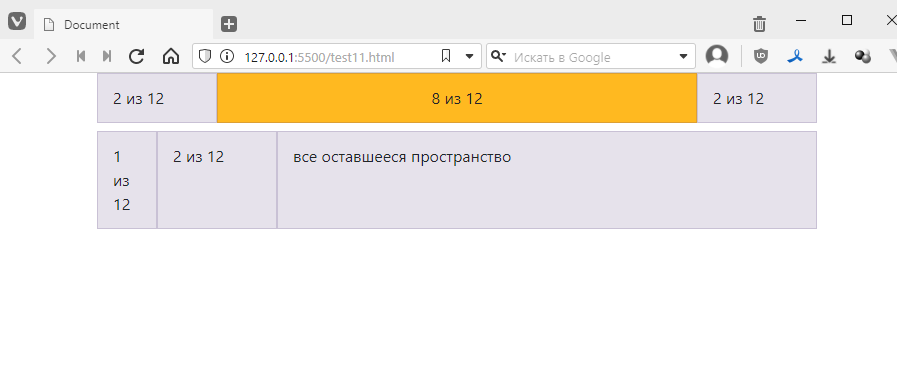
Let’s check:
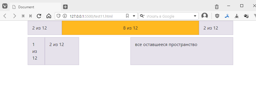
It is true that you cannot add indentation to a certain number of cells to the right of the border, but in these cases you can simply limit the borders of the outer block. For example, if I want to have an indentation of 3 cells on the right, I need to calculate how many cells I already have occupied.
The result is 1 + 2 + 3 (which is the offset) = 6.
The maximum is 12 cells, which means that the last block must be three cells long. We do this:
```html
Using Bootstrap, lay out as shown in the image.
Or, if you feel more confident, lay out the blocks to create a pixel icon.