Complete task 6 using the Boostrap framework.
Creating a flex column
First, I will demonstrate how to create a flex column. I essentially demonstrated this in the previous task, but I will reiterate it here. Let us begin with the basics:
<!DOCTYPE html>
<html lang="en">

<head>
    <meta charset="UTF-8">
    <meta name="viewport" content="width=device-width, initial-scale=1.0">
    <title>Document</title>
    <link rel="stylesheet" href="https://cdn.jsdelivr.net/npm/bootstrap@4.6.0/dist/css/bootstrap.min.css"
        integrity=‘sha384-B0vP5xmATw1+K9KRQjQERJvTumQW0nPEzvF6L/Z6nronJ3oUOFUFpCjEUQouq2+l’ crossorigin="anonymous">
</head>

<body>
    <script src="https://code.jquery.com/jquery-3.5.1.slim.min.js"
        integrity="sha384-DfXdz2htPH0lsSSs5nCTpuj/zy4C+OGpamoFVy38MVBnE+IbbVYUew+OrCXaRkfj"
        crossorigin=‘anonymous’></script>
    <script src="https://cdn.jsdelivr.net/npm/bootstrap@4.6.0/dist/js/bootstrap.bundle.min.js"
        integrity=‘sha384-Piv4xVNRyMGpqkS2by6br4gNJ7DXjqk09RmUpJ8jgGtD7zP9yug3goQfGII0yAns’
        crossorigin="anonymous"></script>
</body>

</html>
I’ll put the base in the body
<div class="container">
    <div class="row">
    </div>
</div>
that is, the container and the row. Now I’ll add a column to the row
<div class="container">
    <div class="row">
        <div class="col">

        </div>
    </div>
</div>
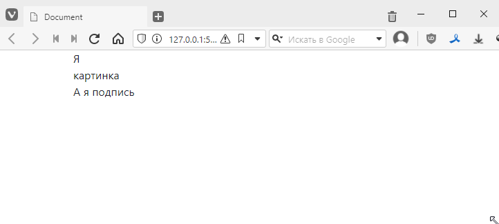
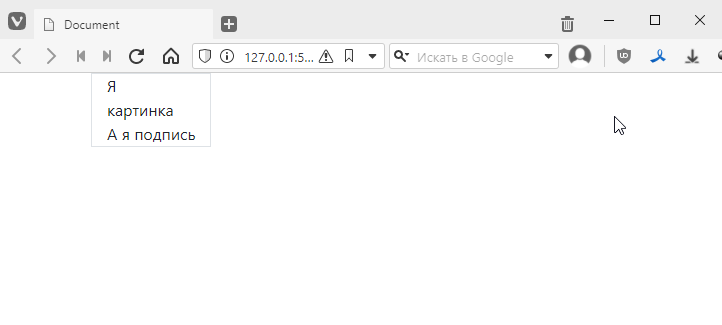
I’ll write in the column
<div class="container">
    <div class="row">
        <div class="col">
            <div>I<br>picture</div>
            <div>And I caption</div>
        </div>
    </div>
</div>
The result will be quite modest:
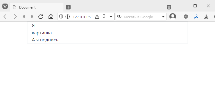
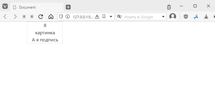
Now let’s add a border to the column to better understand what is happening. Again, everything is great, we already have the border class, we just need to add it:
<div class="col border">
    <div>I<br>picture</div>
    <div>And I am the caption</div>
</div>
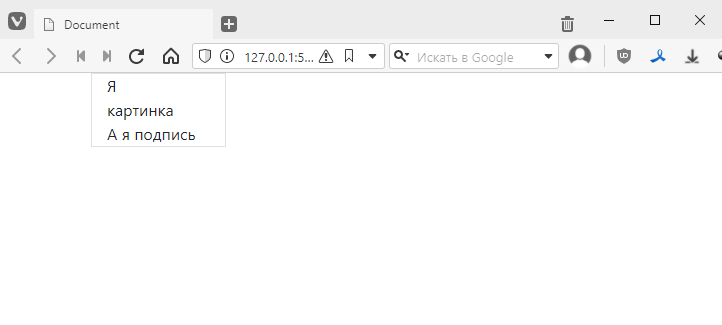
As you remember, the column stretches across the entire width by default. There are several ways to limit it:
- Change the col class to something like col-3, and then the column will occupy exactly 3/12 of the line width:
<div class="col-3 border">
    <div>I am a<br>picture</div>
    <div>And I am a caption</div>
</div>
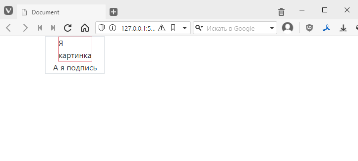
- Or use the col-auto style, and the column dimensions will be adjusted to fit the content:
<div class="col-auto border">
    <div>I am a<br>picture</div>
    <div>And I am a caption</div>
</div>
This is better suited for the task.
Now let’s see how to align the content inside. The easiest way is to simply add text-centre:
<div class="col-auto text-center border">
    <div>Me<br>picture</div>
    <div>And me caption</div>
</div>
This method is basically reliable and can be used. But it only works for simple situations.
An alternative way to turn a column into a flex column:
<div class="col-auto d-flex flex-column border">
    <div>I am<br>image</div>
    <div>And I am caption</div>
</div>
and align using the align-items-center class
<div class="col-auto d-flex align-items-center flex-column border">
    <div>I<br>picture</div>
    <div>And I caption</div>
</div>
And immediately notice that the alignment worked completely differently here: the block with the text ‘I am a picture’ was aligned, but the text inside it remained aligned to the left. Here’s how you can highlight it, for example:
<div class="row">
    <div class="col-auto d-flex align-items-center flex-column border">
        <div class="border border-danger">I<br>am a picture</div>
        <div>And I am a caption</div>
    </div>
</div>
border-danger is the border colour (you can see the full list here https://getbootstrap.com/docs/4.6/utilities/borders/#border-color)
It looks like this
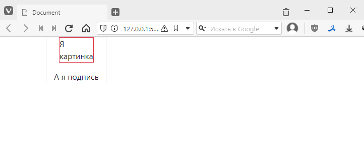
If I want to add a margin below the image, I will add the mb-* style (i.e. margin-bottom), like this:
<div class="col-auto d-flex align-items-center flex-column border">
    <div class="border border-danger mb-3">I<br>image</div>
    <div>And I am the caption</div>
</div>
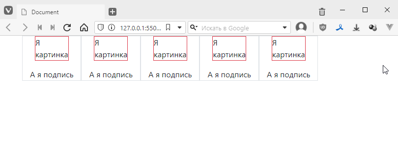
Well, now I can copy and paste blocks:
<div class="container">
    <div class="row">
        <div class="col-auto d-flex align-items-center flex-column border">
            <div class="border border-danger mb-3">I am<br>a picture</div>
            <div>And I am a caption</div>
        </div>
        <div class="col-auto d-flex align-items-center flex-column border">
            <div class="border border-danger mb-3">I am<br>picture</div>
            <div>And I am caption</div>
        </div>
        <div class="col-auto d-flex align-items-center flex-column border">
            <div class="border border-danger mb-3">I am<br>picture</div>
            <div>And I am caption</div>
        </div>
        <div class="col-auto d-flex align-items-center flex-column border">
            <div class="border border-danger mb-3">I am<br>picture</div>
            <div>And I am the caption</div>
        </div>
        <div class="col-auto d-flex align-items-center flex-column border">
            <div class="border border-danger mb-3">I am<br>image</div>
            <div>And I am the caption</div>
        </div>
    </div>
</div>
and get something like this: