How to insert an image
An image is inserted using the img tag, like this:
<!DOCTYPE html>
<html lang="en">
<head>
    <meta charset="UTF-8">
    <meta name="viewport" content="width=device-width, initial-scale=1.0">
    <title>Document</title>
</head>
<body>

    <img src="" alt="">

</body>
</html>
Actually, it has one main property, src, into which you can insert a link to any image.
You can easily get the link in your browser by clicking on any image and selecting

and then pasting the copied value into the src attribute
<img src="https://upload.wikimedia.org/wikipedia/commons/thumb/e/e1/Haanja_2010_01_1.jpg/1200px-Haanja_2010_01_1.jpg" alt="">
However, it will immediately take up exactly as much space as it needs:

Therefore, it is better to limit the size of images using the same styles. For example, I can specify that the height of the image should be exactly 250px
<img style="height: 250px" src="..." alt="">
and the result will be like this

since an image is an ordinary block, it can be styled as desired, for example, by adding a shadow or border
<img class="main-image" src="https://upload.wikimedia.org/wikipedia/commons/thumb/e/e1/Haanja_2010_01_1.jpg/1200px-Haanja_2010_01_1.jpg" alt="">

<style>
    .main-image {
        height: 250px;
        border: 1px solid silver;
        margin: 8px;
        box-shadow: 0 0 16px silver;
        border-radius: 16px;
    }
</style>

How to make a square image
In general, to make a square image, ideally the source should also be square.
You can, of course, try setting the width property equal to the height like this
<style>
    .main-image {
        height: 250px;
        width: 250px;
        border: 1px solid silver;
        margin: 8px;
        box-shadow: 0 0 16px silver;
        border-radius: 16px;
    }
</style>
but then the image proportions will be distorted

In general, the most universal method, which works for both square and rectangular images, is to place the image in a square block:
<div class="main-image-wrapper"> <!-- wrapped in a block -->
    <img class="main-image" src="https://upload.wikimedia.org/wikipedia/commons/thumb/e/e1/Haanja_2010_01_1.jpg/1200px-Haanja_2010_01_1.jpg" alt="">
</div>

<style>
    /* moved all properties from main-image to the block */
    .main-image-wrapper {
        width: 250px;
        height: 250px;
        border: 1px solid silver;
        margin: 8px;
        box-shadow: 0 0 16px silver;
        border-radius: 16px;
    }

    .main-image {
        height: 100%; /* this property was added so that the height of the image would be equal to the height of the wrapper */
    }
</style>

It doesn’t work… if you look closely, you can see that a square shadow has appeared in the background, but the image is still not square.
The problem here is that the image extends beyond the boundaries of the block, and the block does not restrict it in any way.
To prevent anything from extending beyond the boundaries, there is a magic property called overflow: hidden, which disables the rendering of parts of images (and not only images) that extend beyond the boundaries.
<style>
    .main-image-wrapper {
        width: 250px;
        height: 250px;
        border: 1px solid silver;
        margin: 8px;
        box-shadow: 0 0 16px silver;
        border-radius: 16px;
        overflow: hidden; /* added */
    }

    .main-image {
        height: 100%;
    }
</style>

Making a round image
To make a round image, it must be square or inside a square block. We already have that ready.
There is a property called border-radius, which specifies the radius of the block’s rounded corners. So far, we have only used pixel sizes, but if we set the value to 50%, the radius will be equal to half the side of the square, resulting in a circle, like this:
<style>
    .main-image-wrapper {
        width: 250px;
        height: 250px;
        border: 1px solid silver;
        margin: 8px;
        box-shadow: 0 0 16px silver;
        border-radius: 50%;  /* set to 50% */
        overflow: hidden;
    }

    .main-image {
        height: 100%;
    }
</style>

All of this can be wrapped in flex and you will get something beautiful
<div style="display: flex; justify-content: centre;">
    <div style="display: flex; flex-direction: column; align-items: centre;">
        <div class="main-image-wrapper">
            <img class="main-image" src="..." alt="">
        </div>
        <div style="font-size: 2em;">Winter</div>
        <div style="font-size: 1em;">is coming</div>
    </div>
</div>

That’s all there is to it)
[Bonus] Spinning icons
Fontawesome has built-in support for spinning icons. You can read more about it here: [https://fontawesome.com/how-to-use/on-the-web/styling/animating-icons] (https://fontawesome.com/how-to-use/on-the-web/styling/animating-icons) In general, if you want to add a spinning icon, do it like this:
<!DOCTYPE html>
<html lang="en">
<head>
    <!-- ... -->
    <!-- Added a link to font-awesome, as it was not there -->
    <link rel="stylesheet" href="https://cdnjs.cloudflare.com/ajax/libs/font-awesome/5.15.1/css/all.min.css" />
</head>
<body>

<div style="display: flex; justify-content: centre;">
    <div style="display: flex; flex-direction: column; align-items: centre;">
        <div class="main-image-wrapper">
            <img class="main-image" src="..." alt="">
        </div>
        <!-- inserted an icon and added the fa-spin class to it so that it spins -->
        <div style="font-size: 2em;">Winter <i class="fas fa-cog fa-spin"></i></div>
        <div >close </div>
    </div>
</div>

Task
Design a card for a character that is as close as possible to the original, for example:
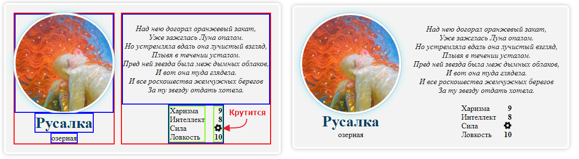
The main thing here is not to get confused in the structure of the flexes: which ones are horizontal and which ones are vertical. On the left is a diagram of the nesting of containers.